The Living Room: a Work in Progress
Do you have a room that just isn’t cooperating with you? You can’t quite figure out what you want to do with it, but you know it has great potential? That’s my living room.
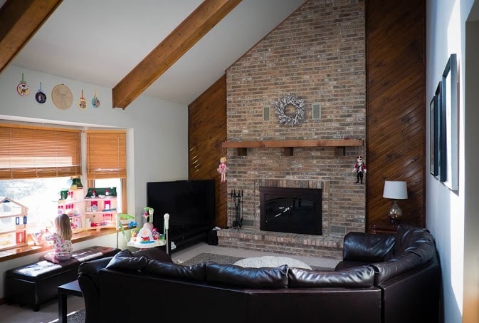
Our living room is the main gathering place in our house. I love that it has a big fireplace. The bay window is a perfect play area for the girls.
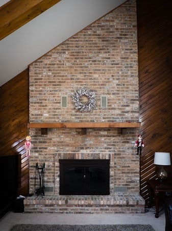
I’m not totally in love with the brick, but it’s fine. I’m not a fan of the wood paneling on the sides, but I’m not sure what I want to do. Paint it? Rip it out? I love the big mantel, but I’m not a fan of the rustic-style look of it. Do I paint it or replace it? Of course, deciding to paint anything then comes with the follow-up question of what color to choose. We’re also slightly limited with how we can decorate the mantel because we can’t cover up the vents when we have a fire going. We finally replaced the fireplace doors to a simple oiled bronze set that we’re very happy with, so at least we have progress there.
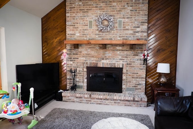
This is another room with terrible carpeting. We decided early on to get a rug to not only make it cozier, but to cover up as much of the carpet as we could. This is a case of us not quite agreeing. If it was just me, I would have gone for a bright (probably teal) rug with some sort of design. That idea was met with a resounding no. The rug we have is comfortable, is holding up well, and will work with any paint and accent colors we choose in the future.

We’re starting to add in touches of color. We bought these Kozyndan prints when we lived in New Zealand. We originally had them hanging over our bed and loved them there, but I’m so happy we made the decision to move them to the living room. They have to color I want and the quirky, fun style I love. There is a fourth print in this series that will be the perfect addition to the room once we get it.
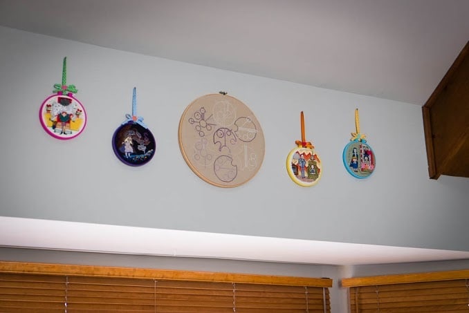
I received the most fantastic hoops from my friend Melissa. There’s a hoop for each girl and a Gallifreyan family tree for the whole family. I originally thought that I would have the girls’ hoops above their beds, but I really wanted to be able to see them regularly and show them off. I thought the space above the window was perfect. They (again) bring in the color I’m after and are an awesome reminder of a good friend.
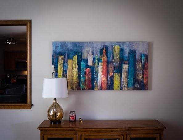
The back wall of the living room (that’s the kitchen behind it) has some odd space because of how we have the furniture arranged. We put an entertainment unit from HomeGoods there and use it for storage and put the city skyline artwork from World Market above it. At Christmas, I decorated the top of the unit and it was a nice space to have.
The living room is slowly getting more personality, and more importantly, *our* personality. I’m not happy with the seating and plan on changing it as soon as I can. It’s what we need to live with for now, though. I need more on the walls. The living room can be quite dark and I can’t quite get the lighting right. And, of course, there’s the wet bar that isn’t pictured here, but if you follow me on Instagram, you know my angst.
If you could get your hands on my living room, what is the first thing you would do? I need some fresh eyes and ideas. I’d love any advice you’d care to throw at me!



I’d paint the wood paneling, mantel, and brick. Even if its not a permanant solution, its going to look better and be a great temporary fix to tide you through until you live there a few years and figure out exactly what you want to do. Painting it a version of white will bring lots of light into the room.
You need some “stuff” on your mantel. YOu can do a lot without covering those vents- layer a few things in and bring in some height.
karri recently posted…Ten reasons to grow your own food
After repainting my own brick fireplace, I’d say go for it! I think all of it can be painted, though I might leave the mantel as is (just my own taste, though). Any way to mount the TV on the wall? Just an idea for clearing up some floor space 🙂
More than anything, more color! Somehow you have to get that teal rug in there. Maybe he won’t notice? 😉
Cori @ Let’s Eat Grandpa recently posted…10 More Better Freezer Cooking Tips and Tricks
We had a similar wall and we dry walled over the paneling and then painted it. It made the room look completely different.
Start by painting the paneling., and mantle. I would also white-wash the brick. Your pics show you are not afraid of color, so a nice area rug picking up a color in your pics will add interest. Also add intrerest *(tall vases with dried flowers and grasses) around the fireplace. Lower the hoops so they can be seen and enjoyed. Window treatments are in dire need along with taller lamps. Add decorative pillows on the couch to brighten the darkness. That’s a start. Nice room.
I wouldn’t paint the brick. It’s very nice and once painted, you can never go back. Often painted brick is a big disappointment compared to the natural brick. Painting the panelling would help lighten up the room. Also, consider putting in a “sunpipe”. They can add a lot of natural light to a room and you don’t have the potential leaks and heat loss/gain that a skylight can have.
If you don’t care for the wetbar, it depends on what you want to do with that space, what your needs are. If you need additional storage, then cap off the plumbing, remove the sink, remove the mirrors and existing shelves and just have cabinets. If you need shelves, add them back over the painted wall. If you don’t need storage, then remove it all and you can place a chair & lamp in that space, and maybe have a bookshelf for a reading nook.
How about open shelves on the paneling, after painting it , then colorful vases and books and pictures, etc. Colorful pillows on the furniture..
This is close to my home living room. I also have the slanted wood paneling. This is what I would do, my hubby does not agree, whatever . Take down paneling. Add floor to ceiling shelves, deep and spaced far enough to out colorful pottery and other accessories. Add something large over fireplace. I have big star.,have had big clock over it too. I would like a deeper mantel, that would be great for you too. Keep accessories around hearth big and tall. Maybe some tall bright ceramic candlesticks, or high grasses. Maybe have an accent wall with contrasting color, add pops of same color on pillows, or in artwork on wall. Add a large colorful artwork with maybe two smaller coordinating side artwork. I would love to show you my current living room. If you are interested, email me back. Good luck, hope I gave you some ideas. KM
OK Decorator here and what I love doing is staging homes for sale. Taking what people have and just rearranging and inexpensive changes. I had to think about yours since it looks like the kids are staying and want to play on that sill. Good idea. First, and most importantly, and why professionally decorated rooms look so good it that the room should not be looked at as “one big space”. You need to create smaller vignettes in each area. So, remember that and the rule of “threes” , very important. Groupings of decorative items should always be in threes, its the way our minds perceive balance. I hear that you love the hoops and pics but, they just need to be “grouped” better.
I would def paint that angled wood next to fireplace and whole room, too. Not beams. Some light earth tone picked up from fireplace colors, like a soft cream color, ceiling, too or it will looked chopped. Do NOT paint the brick at first. It is where you can pickup the color pallet.
Move sofa to the left , exactly as it is, all the way over to the edge of that sill and just slide that ottoman down. Kids still have sill. Now you have a walk area along the right of sofa. If that entertainment unit is lower than the back of sofa, you might put it there. Then it will cover the back of the sofa. If not there, it might fit along the right wall all the way down by where that end table is now but, I might rather see a nice side chair there with a cool floor lamp. ( Creating a vignette in that corner). The end tables are out unless, that one to left of sofa can stay between wall and sofa or at the other end of sofa?. (The one with the curved lags could be painted a funky color and used in the kids room for a table?)
The TV has to be moved up onto a low table, too and angled more towards sofa (and secured so kids cant knock over onto themselves) You might group all the hoops on the blank wall there (small ones surrounding large one) as now you have another “vignette. They need to come down from where they are. They create a huge distraction from the gorgeous outdoor view. And some lighter colored window coverings for the same reason. Since you put them up and down a lot, there are some nice cordless ones that are safer for kids.
The same with the prints. They could go vertically on the right wall next to fireplace to create more height vertically there and add interest to that corner. You need something really big on that blank wall, then. A great textile, like an interesting rug or family quilt (if you have it , would be great and add warmth to room.
As to mantle, just remember the rule of threes and varying heights. I actually do not dislike the wreath but, it is just lonesome there. Here is an idea for a vignette there. On the right side of mantle put that small lamp on right edge and sit the puppets on the mantle to the left of lamp. One leaning against the wall and the other with legs hanging over. Cute! There is your vignette . The puppets should not be hanging off mantle corners.
You also might try to turn the top rug sideways from the way it is now. and put it right in front of fireplace. Get rid of it, is better as it detracts from overall room. Also take down mirror on back wall. It does not add anything there and detracts from painting. It he unit does not go behind couch, as a last resort, keep it there but, there is nowhere for that mirror in this room. Bring in some great throws and pillows with maybe the reddish color in the bricks ?
Remember, I am usually present when work is done and can rearrange as I go but, this is what I see right away. The rug placement needs to be played with, for sure. Hope you like my ideas to pull it all together and make it look designer and still keep it functional and personal.