Modern Royal Color Palette
If you follow me regularly here or on any of my social media channels, you know that we have been slowly working on fixing up our house. And I mean slowly! Sometimes we start out with the best of intentions, like finishing up the rest of our kitchen backsplash, but then we wonder if we should paint our cabinets first, which leads us to how dark our kitchen is and discussing ripping out some cabinets and putting a window in, and, of course, that takes outside help and we have to wait for an opening. We have similar scenarios going on throughout the house, especially our ground floor. I know that there will come a time when things start moving quickly again, so I’m trying not to let too much anxiety through right now and am instead making a solid plan for moving forward, which brings me to creating a color scheme for our house. We decided to go with what I’m calling a Modern Royal Color Palette.
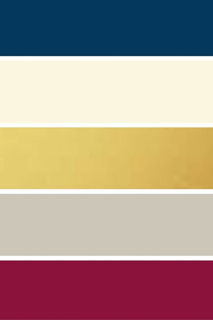
Let me tell you a little bit about the color scheme we chose. I’m a big fan of blues and I love that jewel tones and navy are both trending right now. This blue gives me the updated look that I love, the pop of color that I need, and it’s modern, so people won’t look at the house and wonder what on earth I was thinking (well, they might–but not because of this paint color!). Our walls are already the grey for the most part. Scott loves a rich burgundy and it goes so well with my blue. And you know that I can’t live without my gold accents! The ivory will help tie any areas together that may need it. Any of these colors look good next to each other, and that will be needed.
My idea is to have something of each color in each main room of the ground floor. For example, I am painting two walls in our entry the blue. The grey and ivory already appear on the biggest entry wall. I plan on putting a rug down that has the burgundy and ivory in it. I will have gold accent pieces on our entry table. Our entry flows into the dining room, which will have burgundy on part of the walls and blue in the tablecloth. Moving on to the living room, the blue will be on either side of the fireplace and on the wet bar once it’s finished. There are gold accents on the newly painted cabinets and new sconces will be gold. The burgundy will come in through artwork and throw pillows.
I’ve never attempted a consistent color palette in my decorating before and I’m really excited to implement this one. The Modern Royal Color Palette has the rich colors Scott and I both love, two neutrals to tie them together, and my coveted gold accents.
I would love to know what you think! Did you use a consistent color scheme in your home?


